TasTAFE - Cert3Media
Wednesday, May 4, 2016
Design Lesson 5 Learning Task 8
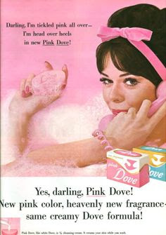
The assignment was to find an example of the Gutenberg flow. I feel this Dove advertisement follows this example. The wording in the top left hand corner is the POA - (Primary Optical Area) and exits at the Terminal Anchor which shows the product. The two dead spots are the top right hand corner which shows the models hair and is unimportant to the product and the bottom left hand corner which shows an unimportant icon to the advertisement.
Design Lesson 5 Task 7
Two magazine articles showing vertical layouts.
Two sources using vertical layouts.
Two layouts that do not follow a vertical grid.
Two sources using vertical layouts.
Two layouts that do not follow a vertical grid.
Friday, October 2, 2015
Learning Task 11
I created a simple logo and added a curve to it. I had to make sure the background was transparent. I also had to save as a .png file.
Learning Task 10 - 4
I took a picture of the leaves and made it a size 512 pixels. I made a new layer in photoshop then copied the layer twice. I put the layers next to each other and then merged the layers. I was lucky in that I did not have to blur the seams as you can not see them in this picture.
Thursday, October 1, 2015
Wednesday, September 30, 2015
Digital Imaging Learning Task 10 - 2
I made sure the foreground color was set to black. I then made a new layer using the gradient layer tool.
Digital Imaging Lerning Task 10 - 1
I like the grayscale coloring and the ocean view.
I like the gradient teal color and the palm trees.
I like the pale pastel coloring and the professionally made cakes.
I like the gradient teal color and the palm trees.
I like the pale pastel coloring and the professionally made cakes.
Subscribe to:
Comments (Atom)


